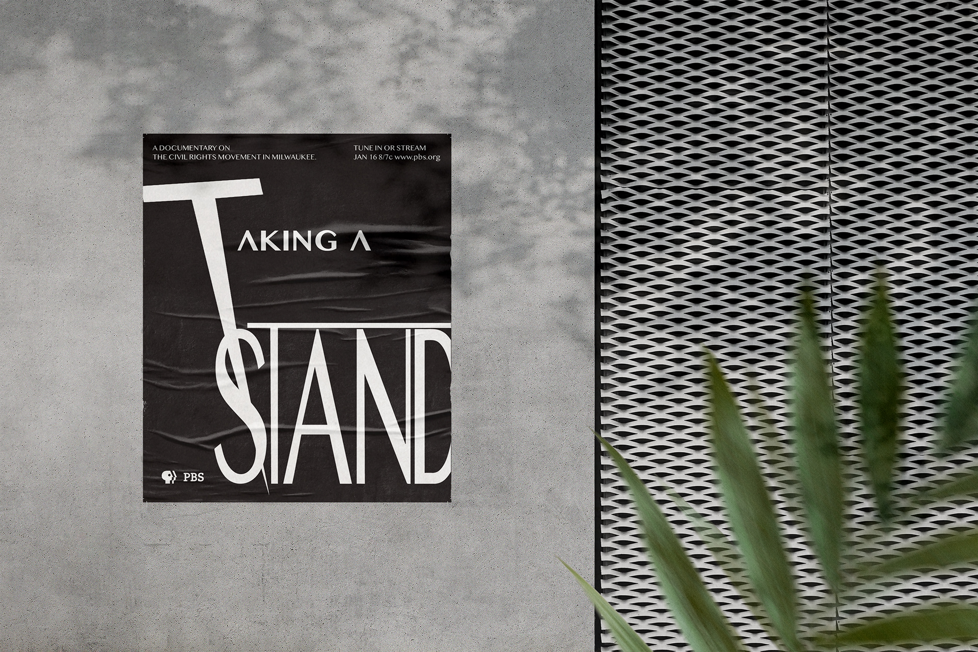
The "Taking A Stand" poster is a poster to advertise a civil rights documentary based in Milwaukee. The project criteria were limited to only typography and black and white colors. A modern minimalist font is used to show a clean and straightforward statement. The Length of the "T" in Taking is used to create flow and to symbolize "taking" since it's stabbing the word "stand". The word "taking" is a focal point that then draws the eye to the condensed word "stand". The word "stand" is tall to symbolize people actually standing up. The letter "T' on "taking" is supposed to symbolize a poster they would march with. The PBS logo is large enough along with the description to display important information. I made the text white and the background black to make the words pop out of the paper and have it easier for the reader to see at first glance.


